Attract, convert & make data-driven decisions.
UI/UX design governs how easily users can interact with data, draw insights, & make informed decisions.
A well-designed user interface provides intuitive navigation & clear visualizations, allowing users to focus on the data
rather than struggling with the tool itself.
Excellent UI/UX design goes beyond aesthetics; it incorporates elements of human psychology (Recognition / Recall) to create a more effective & efficient user experience.
Good UI/UX is not just a "nice-to-have", it is essential to data driven decision-making.
It's water cooler talk.
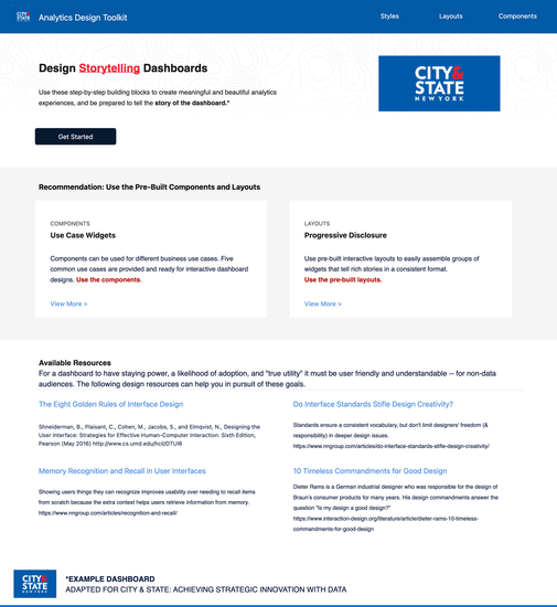
Design Storytelling Dashboards
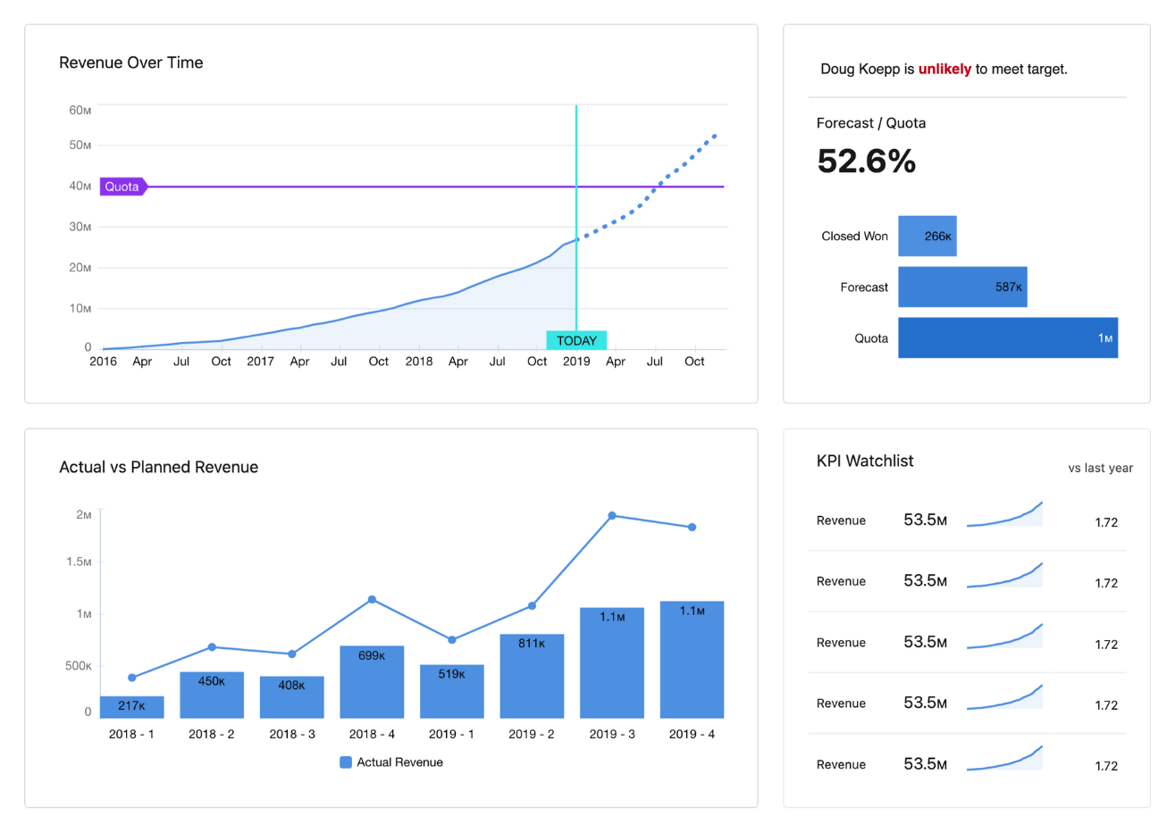
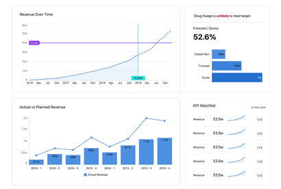
Storytelling Dashboards are a specialized form of data visualization that go beyond presenting data points. They aim to weave a coherent narrative around the data, providing context, insights, and actionable recommendations.
These dashboards are designed to guide the viewer through a data-driven story, making complex information easier to understand and act upon.
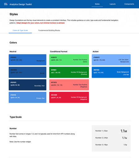
Color Schemes
Color schemes play a critical role in UI/UX design, serving both aesthetic and functional purposes. A well-chosen color scheme can significantly enhance the user experience by improving readability, guiding attention, and evoking specific emotional responses.
Colors can establish a visual hierarchy, guiding the user's eye to the most important elements, such as call-to-action buttons or key metrics on a dashboard. In storytelling dashboards, color schemes help differentiate between various data points and make the data easier to interpret.
Recognition vs. Recall
Recognition: This is the ability to identify something you have previously learned when you encounter it again. In UI/UX, recognition is often facilitated by familiar icons, labels, or color schemes.
For example, a universally recognized trash bin icon for 'delete' helps users understand its function without explanation.
Recall: This involves retrieving information from memory without explicit cues. In UI/UX, this is often seen in search functionalities where users must remember specific terms or categories.
For example, users might need to recall the names of specific data sets or filters when using a complex data dashboard.
*If you’re “searching” I failed.
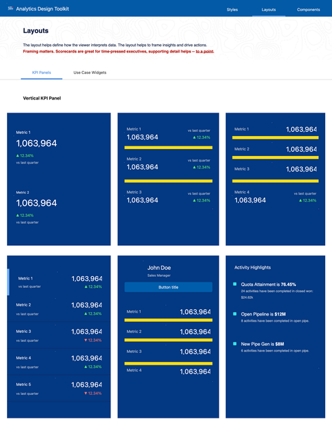
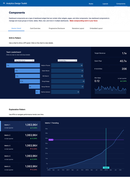
Understand Use Case
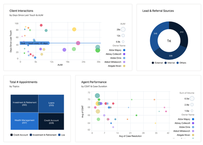
Different use cases have different data visualization needs, and the choice of charts and graphs should align with the objectives and audience of the dashboard.
Trend Analysis: For tracking trends over time, line charts are often the go-to choice.
Comparative Analysis: If the use case involves comparing different categories, bar charts or pie charts may be more appropriate.
Correlation: Scatter plots could be used to identify correlations between variables and spotlight outliers.
Real-Time Monitoring: Gauge charts or speedometer charts are often used for real-time monitoring.
It takes a team.
Each with a specialty, a focus, and a shared respect.

